2021
happÿdonia is a suite to manage a company's internal communications. They are a spun-off from a parent company called Nunsys, which was bootstrapped internally in order to test their ideas in the field. Soon, a loyal user user base started to grow.
Hence, when I met the company, they already had a mature product but needed to be evolved and refined.
I joined the company as a designer and UI developer to help them strengthen the look and feel of their main product and develop new features.
Although the product had a native mobile application, I was asked to aim my efforts to the desktop web app.
Taking into consideration the maturity of the product and how long the product had been running without a designer, Management asked me to focus on improving the user experience by fixing the GUI. Here there are some examples:
The form lacked any kind of verbal guidance or visual structure.
I added a header and hierarchy by reordering the controls.
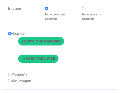
Image crop - Before

Image crop - After
The list had a zebra pattern that added visual noise, specially considering that it used the corporative main color.
Sometimes solutions are as simple as just removing, the color this time. And adding proper spacing between the sections.
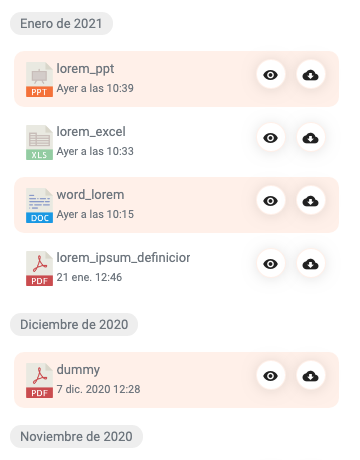
Attachments — Before
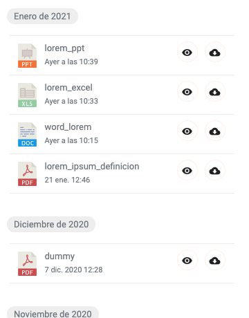
Attachments — After
Email communications had several issues:
But the more important is that the information was not clearly distributed and lacked a predictable order.
I proposed a unified language for every different type of email that focused on delivering the info as brief and clearly as possible.
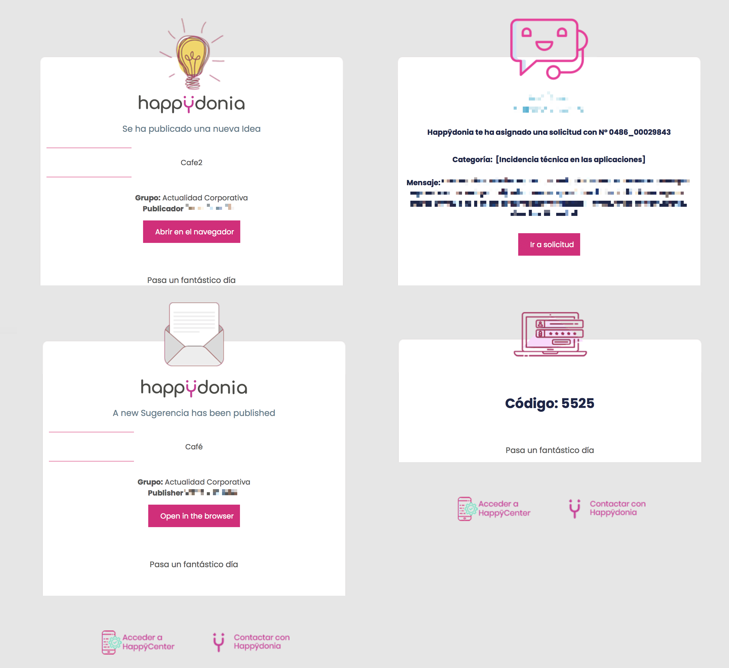
Emails — Before
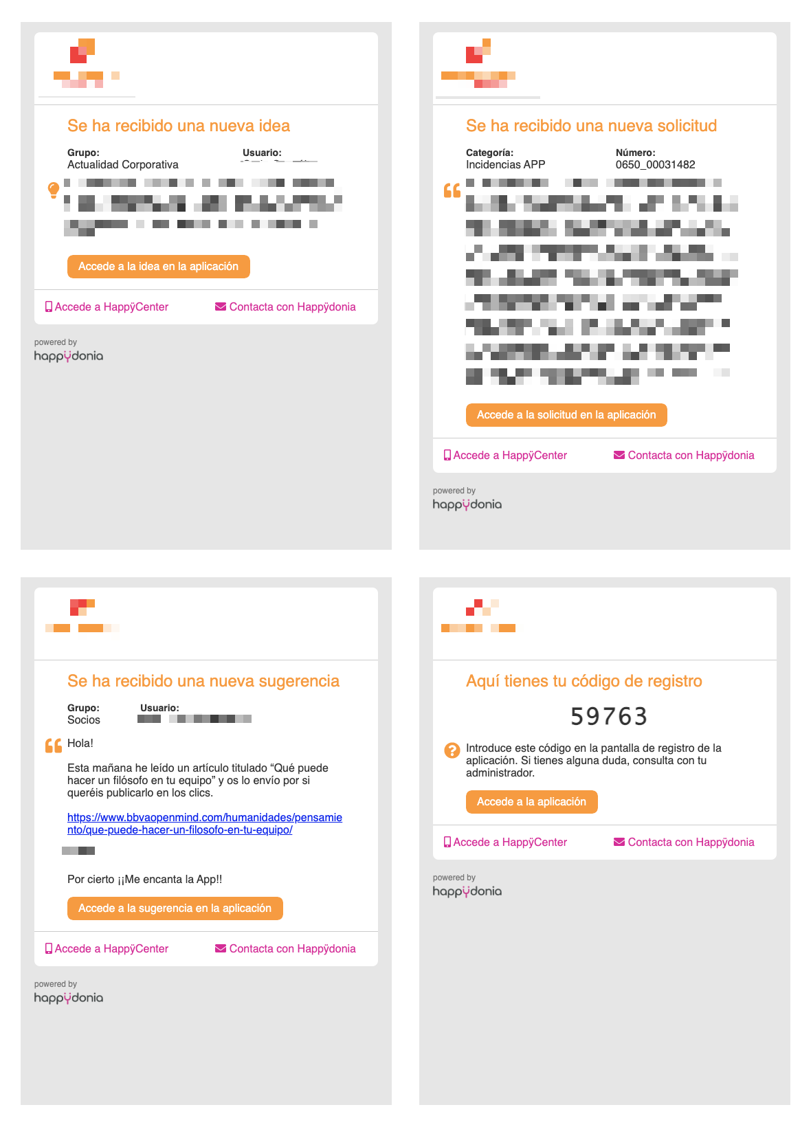
Emails — After
One of the highlights of the application was the internal social network for your company.
Some of the work I did here was:

Post

Event
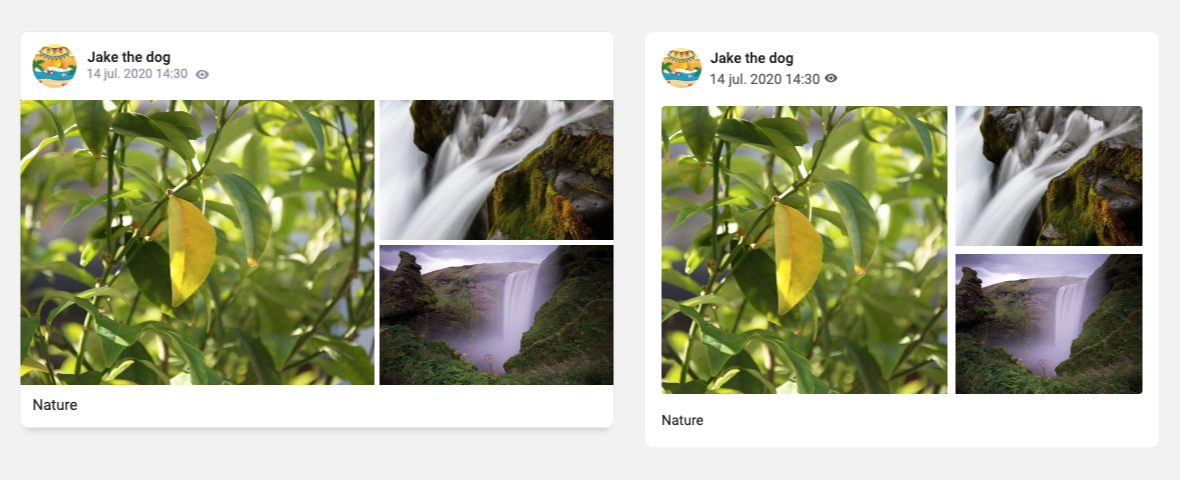
Gallery
The Help Center homepage was obtuse and required the user to click on each section to actually know what information was available.
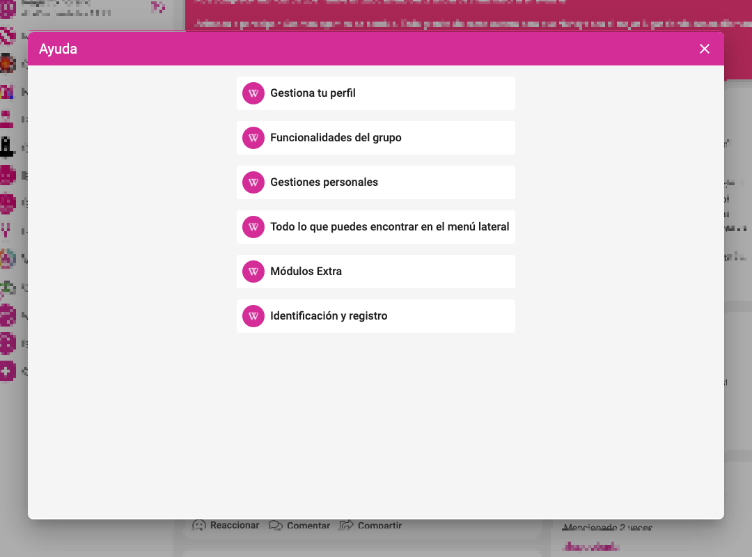
Help Center — After
So I added a short description and up to 3 links with the most requested questions for each area.
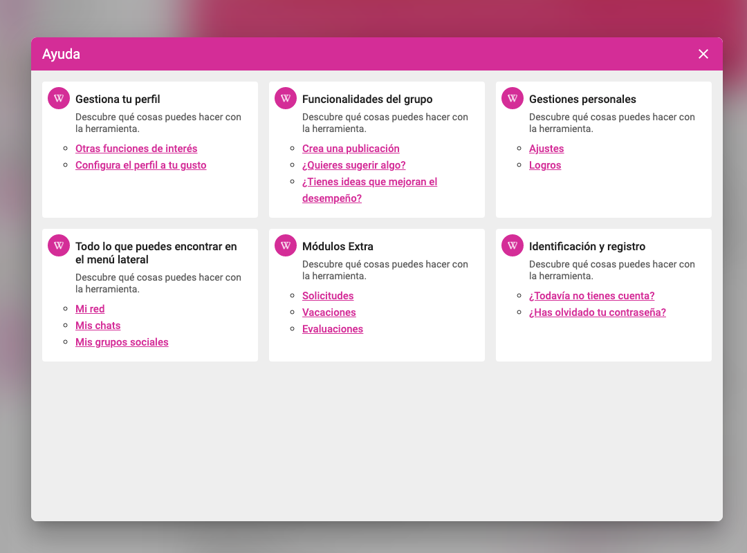
Help Center — After
When joining a company that has run without designers for some time, I like hunting down misalignments and fixing them. It's very rewarding to polish the UI and make it look as good as the product actually is, clearing that quality mismatch between functionality and look and feel.
It's vital knowing how to code HTML and CSS for that matter since you can edit these issues yourself that would normally get ignored by the product manager or would annoy your developer mates when asking for help.
These might feel like minor nitpicks, but visual jankiness permeates in the users mind and lower their quality perception of the product.
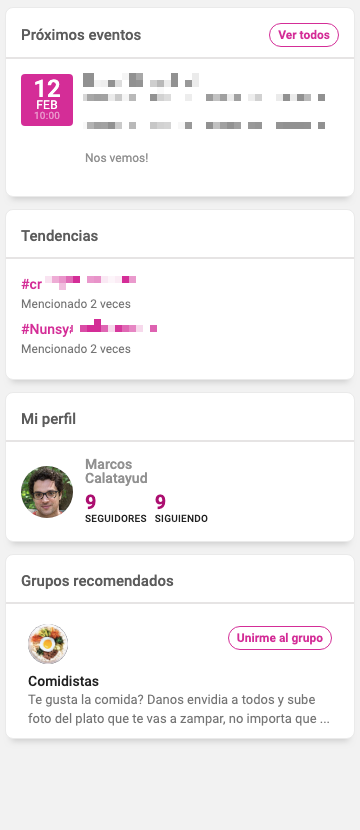
App sidebar — Before
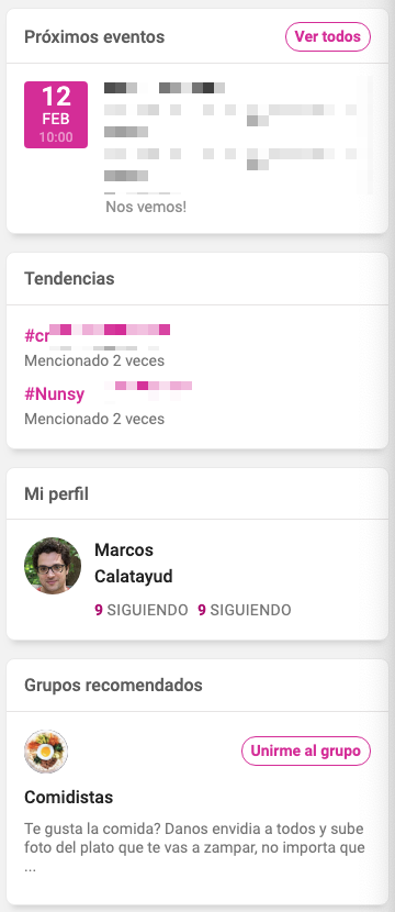
App sidebar — After
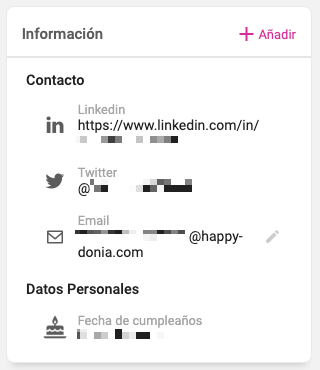
Contact info — Before
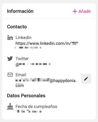
Contact info — After
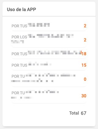
App score — Before
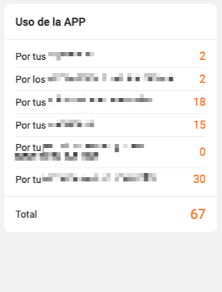
App score — After
When interviewing for the position, I was told there would be a balance between designing new features. Eventually that wouldn't be the case, as I spent most of the time tuning the current UI. That's OK, because it's very rewarding leaving a product looking much better than when you started working on it.